Case Study: Nostalgia, Maximalism, and the Power of Bold Branding
If childhood had a Pantone chip, it would look exactly like this.
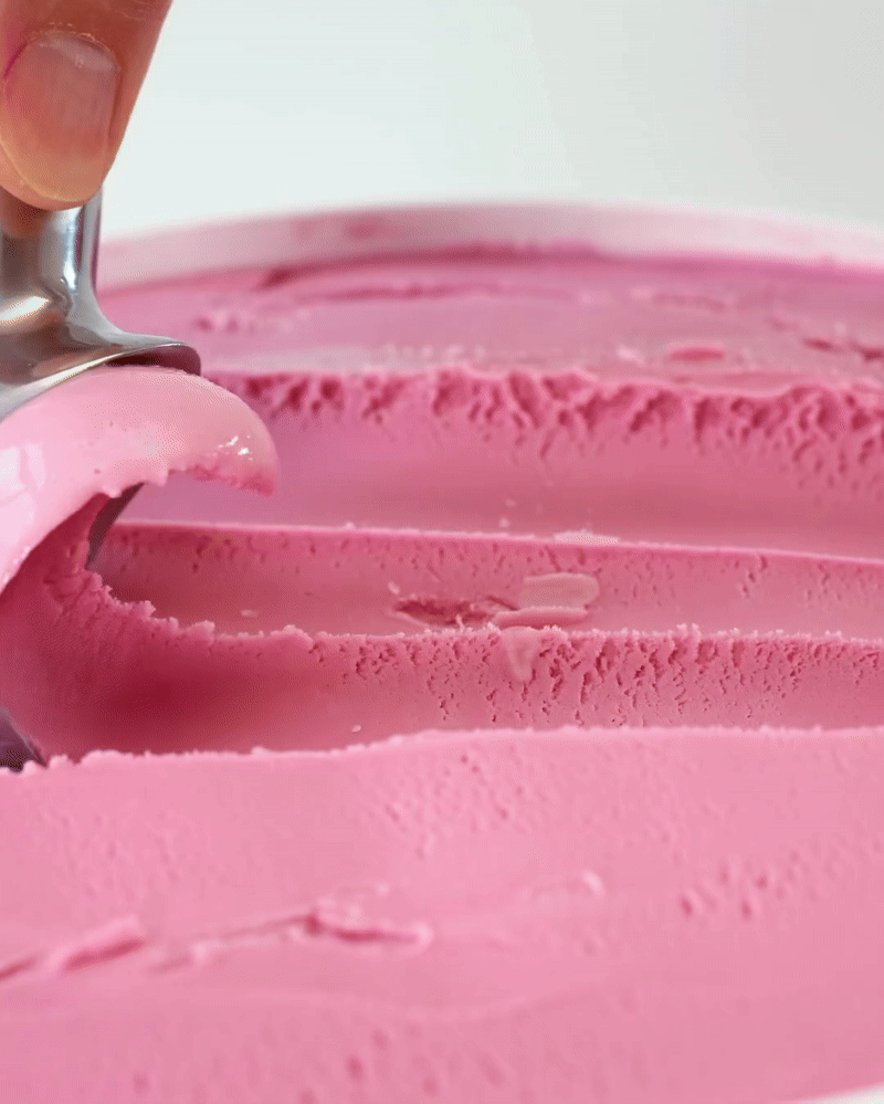
Jeni’s Splendid Ice Cream has tapped deep into the collective memory bank with its new Pink Bubble Gum flavor, and everything - from the color palette to the copy - feels like flipping through a ‘90s sticker album. And, while kitschy, this isn’t just kitsch for kitsch’s sake. This launch is a sharp, strategic execution of a few key branding principles that other brands would be wise to study.


The Color Psychology of Pink Bubble Gum
Let’s start with the obvious: the pink. But not just any pink: this is the punchy, synthetic, borderline fluorescent shade of gum wrappers, vending machines, and sticker books. It’s not sophisticated millennial blush or soothing rosewater; it’s artificial, larger than life. This hue bypasses rationality and taps directly into feeling, making it incredibly effective for fast visual recall and emotional resonance.
Pink Bubble Gum hits you like a memory, like the first few chews of Bazooka, like the inside of a toy store, like something you forgot you missed.
Why It Works
Radical Nostalgia
Jeni’s fully commits to the retro vibes with this one. The graphic language mimics old-school magazine ads and gumball machine graphics. The copy hits the tone of vintage jingles and comic-book bubble captions. And the bunny magician character? Peak 1980s cereal box whimsy.Disruptive Shelf Appeal
On a shelf full of earthy tones, minimal fonts, and “clean” design trends, this explodes. It zigs where others zag and, in doing so, it forces you to take a second look.Reclaiming Artificial for the Sake of Joy
Ironically, while the ice cream itself is made without artificial flavors, the branding fully embraces the artificial (at least visually). It feels like candy, even though it’s ice cream. The result is layered: your senses say childhood, your palate says craft, and your brain says, “Add to cart.”
All Ages Welcome
This is not just a kids’ flavor. The tagline (“Made for kids and grown-ups alike”) makes that clear. The messaging invites adults to reinhabit their joy, if only for a few scoops.
What Brands Can Learn
Maximalism is having a moment. Use it. Don’t shy away from color saturation, layered graphics, and unexpected elements. Especially in saturated categories.
Nostalgia should feel specific. Generic retro doesn’t land. This campaign pinpoints a multisensory memory (bubble gum’s first 30 seconds) and builds everything around it.
Color as more than mood. Jeni’s shows how to effectively weaponize a color. The right shade, with the right supporting visuals, can trigger a whole cultural experience.
Jeni’s Pink Bubble Gum is a love letter to a very specific sensory memory, executed with total conviction. In a branding landscape that often prizes restraint, Jeni’s proves there’s power in going big, bright, and borderline bonkers.
The takeaway for other brands?
Don’t dilute a bold idea for the sake of polish. If the concept is strong, the color is right, and the nostalgia is earned, you don’t need to tone it down. You just need to turn it all the way up.