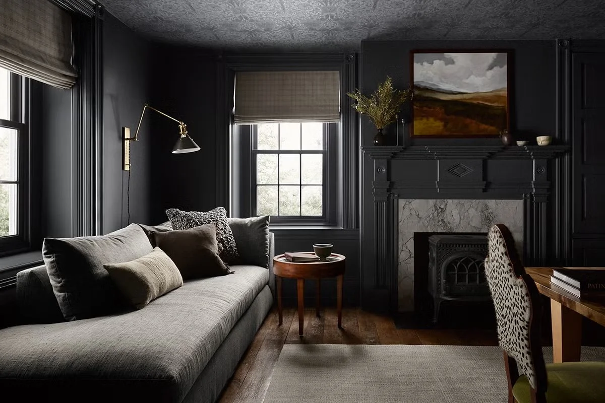
Color Drenching: Not Just for Walls
Can You Commit to Just One Shade?
Color drenching floods an entire space with one key hue (walls, trim, ceilings, even furniture) creating a cocooned, immersive color experience. It’s a full-body experience. And in 2025, it's one of the most compelling design moves, whether you're painting a room or defining a brand identity.
In a sea of sanitized templates, brands that fully commit to a singular, saturated visual experience feel intentional, elevated, and emotionally resonant. While many companies are still playing in safe palettes and white space, color-drenched branding grabs attention by doing the opposite: making color the main character.
This approach offers a fresh alternative to the over-reliance on clever copy or motion to do the heavy lifting. When executed well, a fully saturated brand system communicates mood, intention, and value before a single word is read. Whether it's a campaign drenched in mustard, a site that hums in forest green, or packaging that leans fully into monochrome blush, color becomes the first, and often most powerful, form of expression.
What CIC (Color as Immersive Context) Means for Brands
Brands can treat websites, campaigns, and visual identities the same way designers drench rooms: choosing a single bold hue and letting it dominate every surface for deeper emotional impact.
When you drench a brand in one color family, you eliminate unnecessary distraction. A monochrome system creates contrast by constraint. Suddenly, buttons, interactions, CTAs, and hero moments shine without shouting, allowing the user to be guided rather than bombarded.
For example, imagine a brand that launches a new capsule collection and decides to “drench” all supporting materials, from homepage to digital ads and social content, in one emotional, evocative color.
The result? Unified storytelling. Clear visual language. And a campaign that feels like a moment.
The result? Unified storytelling. Clear visual language. And a campaign that feels like a moment.
1. Create Emotional Immersion
In interiors, a deep burgundy room feels intimate. Online? Wrap your homepage, navigation, and launch banner in a singular shade (e.g., oxblood or cobalt) for immediate mood setting.
The sensory shift, like dimming contrast, invites users to feel, not just see.
2. Clarify Visual Hierarchy
Removing competing color distractions clears the visual field. Visitors instantly notice motion (like hover states), CTAs, and content hierarchy.
Just as a monochrome room “blurs lines” to look bigger, a monochrome website feels more spacious and focused.
3. Amplify Brand Identity
An immersive color treatment isn’t just “decorative.” Choosing a precise shade (sage, mustard, teal, or grey) communicates a mood: serene, bold, playful, or introspective.
It positions the brand as confident, curated, and caressed in color.
4. Highlight Texture, Type, & Interaction
In a monochrome layout, shadows, scale, hover animations, and typography become your storytelling tools, just like textures enrich single-hue interiors.
Use micro-interactions to gently shift brightness or saturation, digital “gloss on trim.”
5. Start Small, Go Big
Just like a powder room is a low-commitment space to test drenching, brands can start with immersive email drip sequences or campaign-specific microsites.
These smaller engagements test the emotional resonance before rolling out to full site refresh.
How to Use Color Drenching for Your Brand
Choose your hue: Pick a shade that aligns with your emotional brand DNA (calm, bold, creative).
Drench uniformly: Apply it across site sections—hero background, button backgrounds, footer, newsletter form.
Layer by depth: Use tonal variations—slightly darker for modal backgrounds, lighter for hover states.
Texture & type: Add visual richness with subtle patterns, gradients, or expressive fonts.
Test on small channels: Email hero banners, LinkedIn ads, IG filters before committing broadly.
Measure emotional impact: Track dwell time, scrolls, and conversion uplift vs neutral layouts.
Why Most Brands Won’t Do It (& Why That’s Your Opportunity)
Drenching requires commitment. It asks a brand to be self-assured enough to hold one note. It resists the urge to be everything, everywhere, all at once. And in doing so, it actually does stand out everywhere.
Most brands will hesitate. They’ll fear repetition or lack of contrast. But the truth is that visual restraint often creates deeper emotional impact than visual noise. That’s exactly where forward-thinking, creatively confident brands have an edge.
This is especially true in an era when design sameness is rampant: templates, best practices, and plug-and-play systems have led to a flattening of brand identities. Color drenching offers the opportunity to disrupt that pattern. It invites differentiation through saturation, mood through minimalism, and story through shade.
Think of color drenching as a transformational strategy. It amplifies emotion, drives attention, and delivers clarity. From bedrooms to browsers, immersive color stops people mid-scroll and turns curiosity into connection.
At Color Colour Creative, we use drenching as a structured tool that is faithful to your brand’s voice and bold enough to demand attention. Let’s get immersive.


