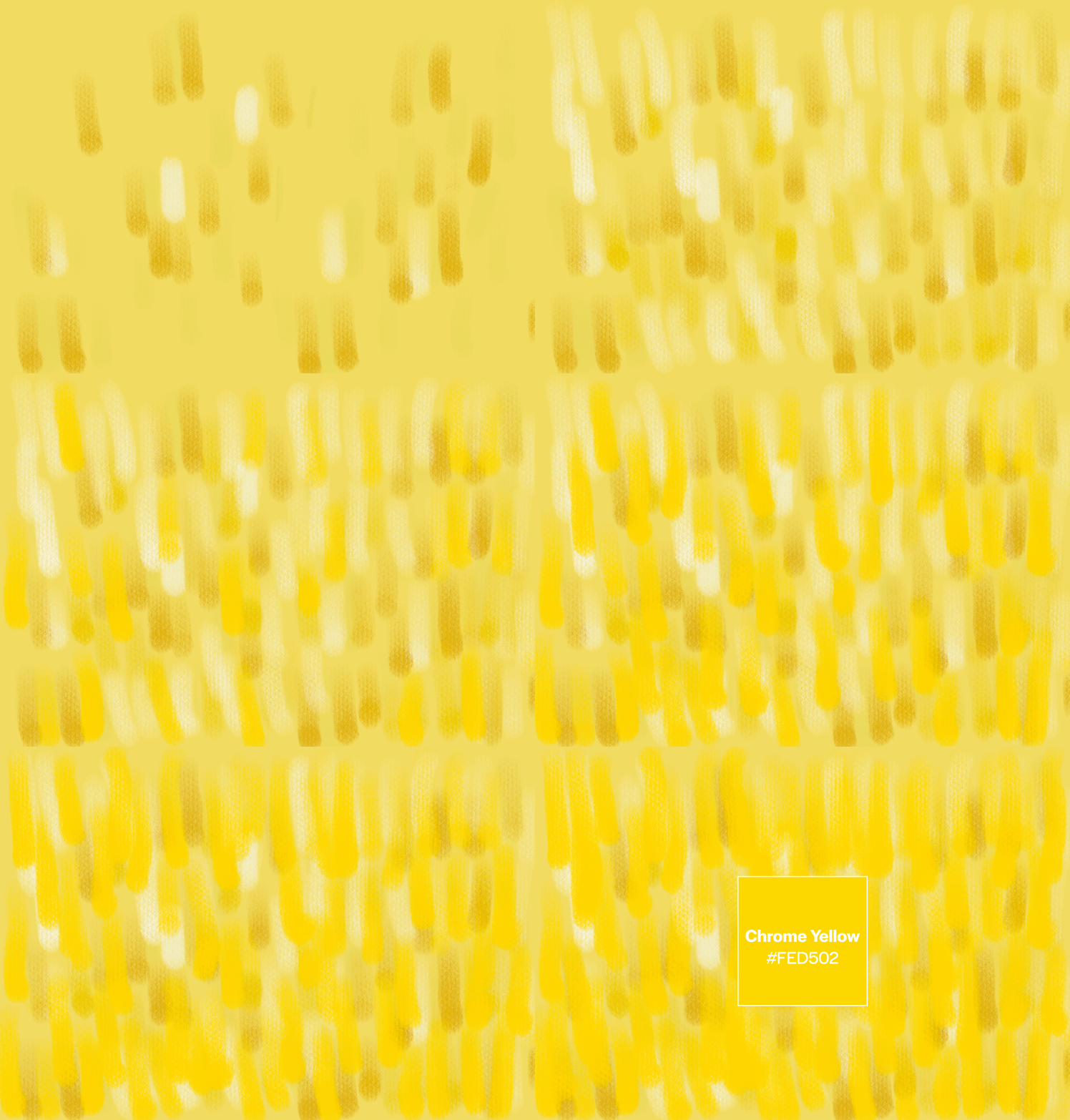
Chrome Yellow: The Brightest Note in a Painter’s Symphony
If sunflowers had a soundtrack, it would be Chrome Yellow: rich, radiant, and utterly unforgettable.
This isn't just any sun-soaked yellow - it’s the yellow of Van Gogh’s fever-dream florals, the yellow of obsession and alchemy, of glory and eventual decay. Like many of our favorite colors, Chrome Yellow has a vivid past, and an equally punchy place in the future of branding and design.
Van Gogh’s obsession with all things Chrome Yellow.
The Color That Launched a Thousand Sunflowers
In the summer of 1888, Vincent van Gogh moved into his famed Yellow House in Arles, France. He was, by his own admission, deliriously happy spending his days painting, dreaming up an artist’s colony, and filling canvas after canvas with golden blooms. His goal? A studio overflowing with sunflowers, rendered in what he described as a “symphony of harsh or broken yellows.”
At the heart of that symphony? Chrome Yellow.
Discovered in 1762 from orange-scarlet crystals found deep in a Siberian gold mine, the pigment was born of scientific curiosity. French chemist Nicolas Louis Vauquelin isolated the mineral’s secret: a new metal he named chromium, from the Greek chroma, meaning “color,” due to the rainbow of tones its compounds produced.
By 1809, Chrome Yellow was the darling of avant-garde painters across Europe. For the first time, yellow could hold its own next to the vibrant reds and deep ultramarines flooding artists’ palettes. Van Gogh, as ever, went all in.
But like all fleeting things, Chrome Yellow had a fatal flaw: it darkened over time. Sunlight, ironically, hastened its decline. As researchers now confirm, Van Gogh’s sunflowers are slowly fading, their once-vivid petals dulling to muted browns. His florals wilt on canvas, just as they once did in their vases.
Still, the spirit of Chrome Yellow beams on.
Ritual’s website heavy use of Chrome Yellow, spanning from hover states, buttons, background images, and features it’s complementary color – blue.
Why It Works in Branding
This is not your polite buttercup. Chrome Yellow has an opinion. It demands attention without begging for it, balancing warmth with edge. In brand design, Chrome Yellow is all about high energy, clarity, and confidence. It signals optimism, audacity, and joy with a hint of mischief.
It’s especially powerful when used:
In editorial-forward layouts (where it offsets black-and-white imagery or type)
As a call-to-action accent - think buttons, scroll cues, interactive hovers
In packaging where shelf presence is everything
Paired with high-contrast neutrals or deep jewel tones for instant drama
Palette Pairings We Love
Modern Monochrome
Chrome Yellow + Buttercream + Goldenrod + Burnt Ochre
- For packaging that feels artisan but not twee
Editorial Electric
Chrome Yellow + Gunmetal + Paper White + Cobalt Blue
- For a contemporary mag or media brand with bite
Playful & Punchy
Chrome Yellow + Electric Pink + Teal + Charcoal
- For Gen Z beauty brands, digital culture projects, or music-aligned identities
Omsom’s website and packaging use tones of Chrome Yellow.
Brands Using It Brilliantly
Ritual
This modern wellness and vitamin brand utilizes Chrome Yellow as bright and cheery photo backgrounds, offsetting the brightness with navy and white, as well as a strikethrough hover state for links.
Omsom
This brand brings Asian flavors into your home and amps up the flavorful excitement through the use of Chrome Yellow, tan, and red as their digital color scheme.
Telfar
Chrome Yellow has made appearances in capsule collections and campaign backgrounds, amplifying a sense of now.
One of Telfar’s Chrome Yellow collections.
Using Chrome Yellow in Digital Design
Chrome Yellow shines (literally and figuratively) on screens, especially in scroll-based storytelling or interactive UX.
Use it to:
Highlight headlines that drive a narrative
Inject warmth into a clean, grayscale palette
Add motion or hover states to static designs
Create contrast in accessibility-forward interfaces (bonus: it holds up well for visibility)
Just beware of its saturation level - Chrome Yellow performs best with breathing room. Don’t crowd it.
Final Thought
Chrome Yellow is the color of obsession, invention, and intensity. It’s Van Gogh racing the sun.
In branding, it signals that you’re not afraid to take up space, to be radiant, unapologetic, and unmissable.
And at Color Colour Creative, we know how to wield that energy. Whether you're ready for a full rebrand or just a seasonal refresh, we can help you find your brand’s boldest note and hit it in perfect pitch.


