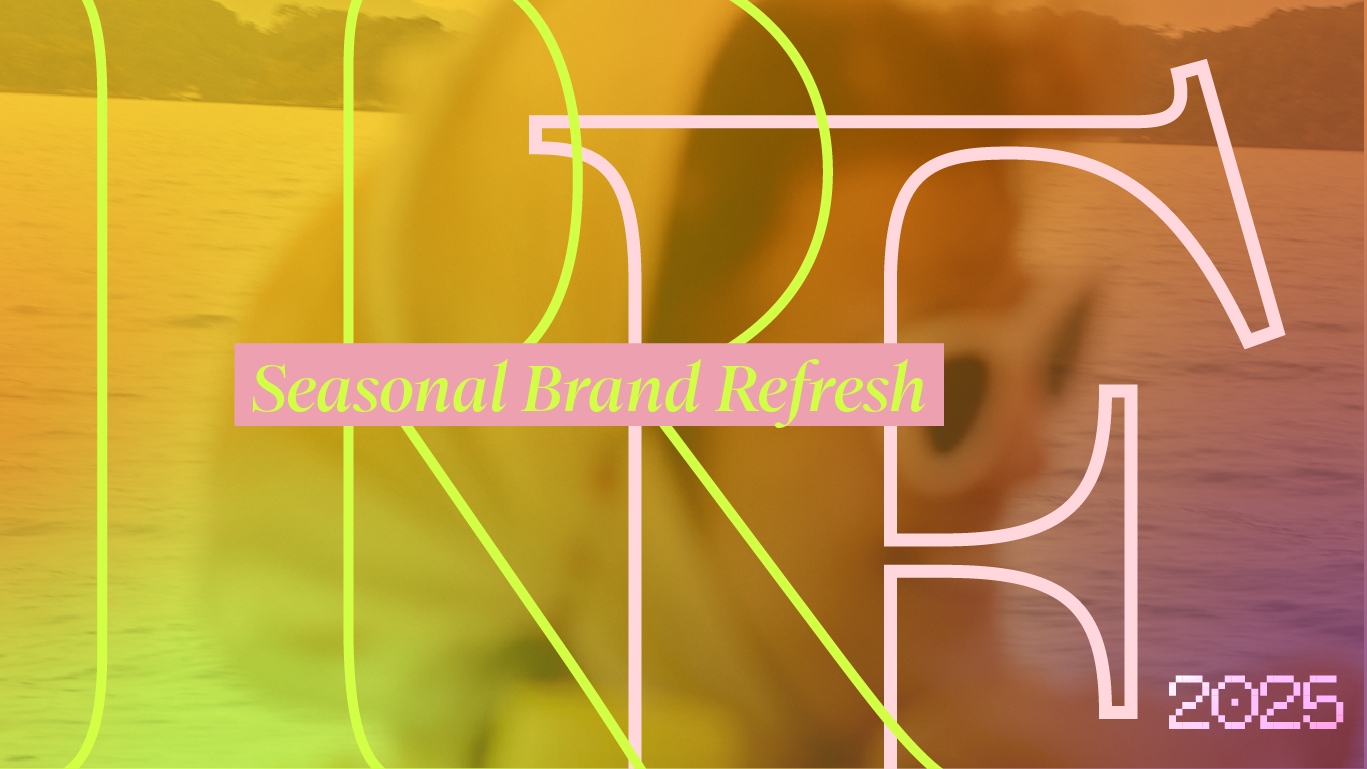
The Seasonal Brand Refresh: Why Spring Cleaning Isn’t Just for Closets
A Color Colour Creative Perspective
Seasonal shifts do something to us. As the light changes, so does our appetite - for food, for clothing, for color. And in branding? That same instinct applies. Just as we swap coats for linen and crave citrus over squash, brands can (and should) respond to the seasons to stay fresh, relevant, and resonant. Just as nature cycles through seasons, so should your brand.
Summer doesn’t ask permission to be seen, it just shows up in full color. It is louder, brighter, bolder, It casts everything in golden hour light and makes even the most mundane moments feel more cinematic.
At Color Colour Creative, we believe in the power of the seasonal brand refresh. Not a full rebrand. Not a dramatic identity overhaul. Rather a thoughtful recalibration. A chance to say we’re here, we’re awake, and we’re paying attention.
Welcome to the concept of the Seasonal Brand Refresh, a low-lift, high-impact way to breathe new life into your brand by syncing your creative expression with the rhythm of the season.
Why Seasonal Updates Matter
Attention is currency, and seasonal cues are a cheat code for earning it. They tap into a collective cultural rhythm, a sense of right now. Brands that adapt seasonally signal vibrancy, awareness, and care. They invite their audiences to re-engage, linger longer, and reimagine their relationship to the product or service.
Summer is an important time for a refresh, too. Inherently optimistic, the season itself is associated with energy, expansion, and vitality. For brands, this gives you an opportunity to be more playful with your tone of voice, to experiment with vibrant color palettes, and to refresh your visuals, UX, and storytelling to reflect what your audience is already feeling.
A seasonal brand refresh might mean:
Swapping out photography and color palettes to reflect seasonal moods
Updating campaign headlines to play into cultural moments or visual metaphors
Reimagining your homepage hero to feel editorial, current, and alive
Adjusting email tones or packaging details to mirror the shifting energy
The Color Colour Take: A Seasonal Hue Shift
Each season has its own color vocabulary, and summer's is alive—think: sun-warmed terracotta, crystalline turquoise, citrus sorbet, strawberry pop, neon watermelon, verdant leaf, bleached sand. For summer 2025, we’re forecasting a few key shades with range:
Persimmon — bold, juicy, and energetic
Ocean Glass — a translucent aquamarine that reads both luxe and chill
Poppy — a commanding red-orange that commands attention without aggression
Chlorophyll Green — hyper-fresh, like a plant that’s just been watered
Pale Citron — soft, lemony, and unexpectedly versatile
Ideas for a Summer Brand Refresh
You don’t need to overhaul your identity to make it seasonal. Here are a few entry points:
Update your homepage hero with a seasonally art-directed visual or color wash.
Swap in a fresh color accent across buttons, borders, and calls to action.
Revamp your newsletter header to feel lighter and more sun-drenched.
Infuse summer into your social grid and play with gradients, pops, and playful language.
Rethink product styling or photography - lean into natural light and color-blocked scenes.
What Makes This Work?
A seasonal refresh signals vitality. It shows your audience you’re not static. You’re responsive, attuned, evolving. It can also lead to measurable outcomes: higher engagement, longer on-site dwell time, more scrolls, more shares.
It’s not just pretty. It’s performative design.
Real-World Examples We Love
Maisonette: Their seasonal refresh screams “soft summer” with butter yellow (how of the moment!) and muted Indigo making up the bulk of their color palette. Within their Summer Shop, the alternating lemon yellow flat lays and hyper-seasonal editorial would make anyone excited for the season ahead.
Net-a-Porter: Their homepage feels like a seasonal moodboard. Summer travel brought to life, the hero video is both sun-washed and breezy one moment, the romance of a hot tropical night the next.
Otherland: The candle company brings Summer to life with their Beach Club Collection, incorporating tropical florals, melon hues, and juicy scents to match.
How CCC Approaches the Seasonal Refresh
We treat each brand like a living, breathing editorial object. That means:
Creating quarterly campaign concepts that tap into seasonal emotion
Refreshing key brand visuals with intention: color pairings, typography play, tone-of-voice
Building moodboards for the season ahead to guide content and design direction
Strategizing ways to make “just enough” impact, so your brand evolves but never loses its center
The Spring/Summer 2025 Forecast
Expect a rise in playful serifs, hand-drawn accents, and sun-faded colors like ochre, papaya, seafoam, and heliotrope. We're leaning into mismatched grids, layered visuals, and small, poetic details that make your digital presence feel less templated and more human.
At Color Colour Creative, seasonal branding is part of our core philosophy. We help brands feel - not just look - timely. From web refreshes to art direction and palette consulting, we approach color and creative direction with editorial intuition and design intelligence.
Need help translating your Summer state of mind into something your audience can see and feel?
Let’s make it seasonal. Let’s make it emotional. Let’s make it work.