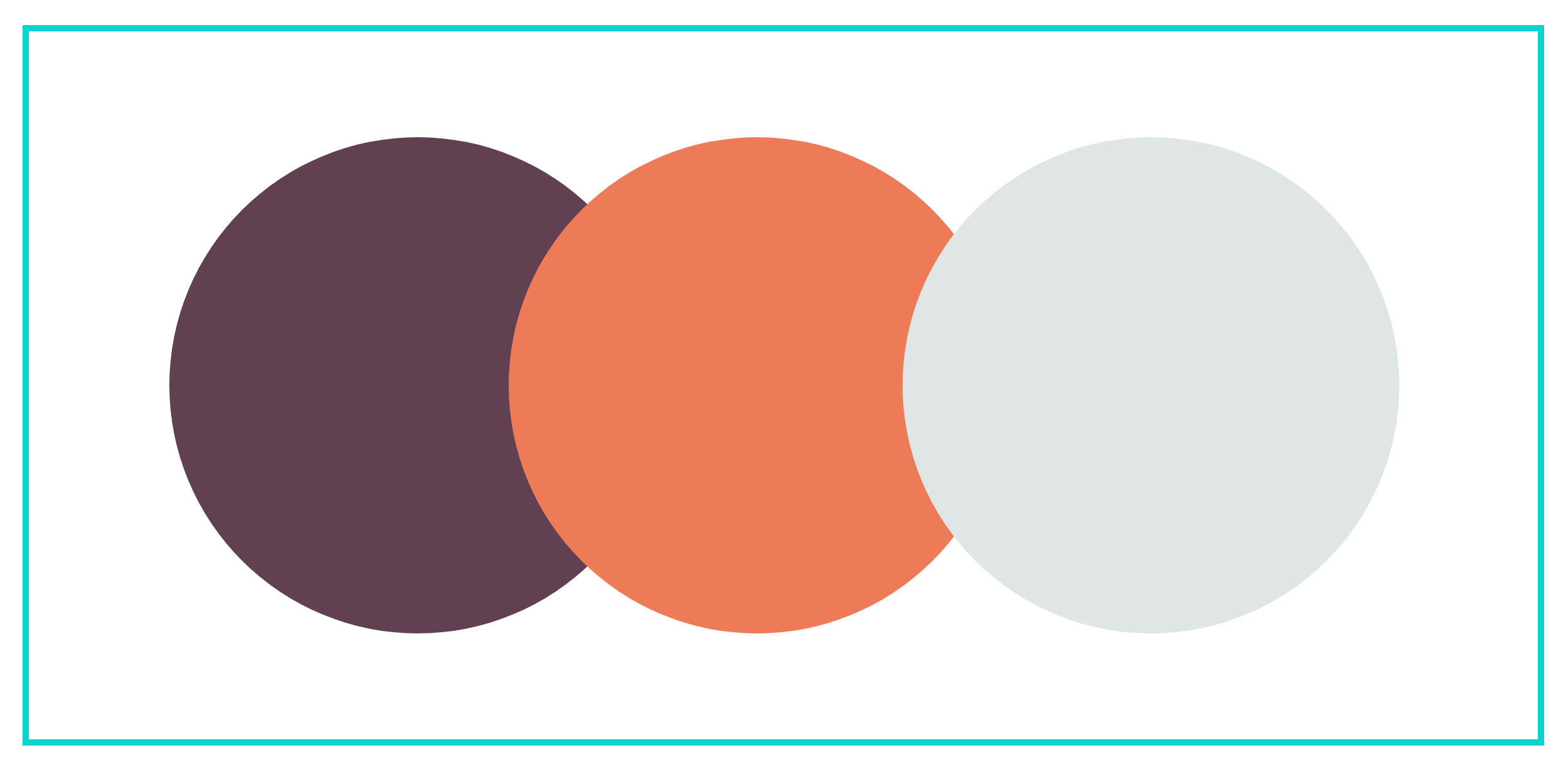
The Color Comeback: Why Bold, Saturated Palettes Are Dominating Web Design in 2025
Once muted, now magnetic. Color is no longer playing it safe when it comes to design.
In the era of sleek minimalism and neutral dominance, a bold shift is happening - color is making a comeback. And not just any color: in 2025, designers are embracing hues that are emotionally driven, culturally rich, and visually unapologetic. From absinthe green to powder blue, mauve to kelly green, color is no longer just a design detail but the story itself.
We are witnessing a powerful resurgence of bold, saturated color palettes across branding and digital design, ushering in a season where beige minimalism takes a back seat to vibrancy, play, and personality. This isn’t just a trend; it’s a creative correction.
From Neutrals to Nuance
For years, the design world bathed in shades of oat milk, greige, and dusted taupe. It felt calm. Clean. Safe. But it also became ubiquitous, blending brands into a beige blur. What we’re seeing now is a decisive pivot: a collective craving for chromatic clarity. Designers are re-embracing color as a storytelling tool, a mood-setter, and a distinctive signature.
Why the Shift?
After years of grayscale user interfaces and sanitized branding, audiences are craving something that feels alive. Bold colors inject instant emotion, personality, and depth into a digital experience. In a crowded web space, standing out isn’t about shouting louder - it’s about showing up more vividly.
This shift toward bold palettes is more than a seasonal whim. It’s a reflection of cultural appetite, a craving for clarity, joy, individuality, and aliveness. In an era of overstimulation and aesthetic sameness, color becomes a differentiator. A brand’s voice, just turned all the way up.
We're also in the midst of a digital renaissance, one where Gen Z and younger millennials are actively rejecting sterile feeds and hyper-filtered perfection. They want brands with a pulse, web experiences that feel, and color delivers that immediacy.
What It Looks Like
Interactive Color Shifts: Backgrounds that morph subtly as users scroll, giving the feeling of movement and energy.
Color as Navigation: Using color-blocked sections to guide the user journey, with each palette shift signaling a new chapter or offering.
Unexpected Pairings: Acidic greens with soft lavenders. Burnt orange with dusty blue. Pairings that create a sense of visual tension and memorability.
It’s Not Just Color: It’s Intentional Energy
This trend isn’t about rainbow chaos. It’s about curated boldness. Expect to see:
Electric accents on otherwise clean layouts
Full-bleed backgrounds in statement shades
High-contrast typography that pops against saturated backdrops
Designers are also pulling from fashion’s love affair with dopamine dressing, translating those same hues into web environments that delight and disrupt.
Color Colour Palettes to Test
Need some inspiration for bold ideas?
Feels modern, dreamy, approachable: electric lilac, sheer butter yellow, grounding olive
Feels moody, tactile, editorial: aubergine, burnt sienna, steel
Feels earthy, elevated, cozy: sage, brick red, blush mauve
Feels clean, energized, future-forward: cobalt blue, acid green, soft clay
Feels zesty, playful, appetite-inducing: persimmon, teal, grapefruit pink
Color Colour Creative took over Prose’s website using cobalt blue, acid green, and soft clay. Not only does it feel clean, energized, future-forward, but it gives Prose some personality pop.
Standout Examples
Glossier’s latest digital campaigns feature punchy lilacs and rich greens layered over playful product photography proof that color doesn’t cancel out elegance.
Violette_FR’s ecommerce site is a love letter to color: from vibrant photo backdrops to saturated hover states, it turns the scroll into a sensory experience.
Lisa Says Gah utilizes playful, colorful banners and typography, drawing the user into the world of the brand.
How to Make It Work for Your Brand
Not every brand needs to go full technicolor. The key is using color as a carrier of emotion and meaning:
Choose one bold hue as your brand’s anchor, something that’s unmistakably you.
Think about color in motion: how does it transition, react, hover, or animate?
Explore color storytelling: could your seasonal palette reflect your product drop? Your mood? Your mission?
Color Is Having Its Main Character Moment
In 2025, brands no longer need to blend in to feel modern. Bold palettes signal confidence, clarity, and intentionality. Whether it’s a shock of saffron or a wash of electric teal, color is back to do what it does best: make us feel.
Don’t be afraid to lead with color. Build a palette that reflects your tone of voice, emotional intention, and brand purpose. Color is one of the first things users feel - make it count, because right now? We want to feel alive.


