Violet: The Visionary Shade That Refuses to Fade

From Impressionist Rebellion to Branding Renaissance
In the spectrum of color psychology, violet sits at the crossroads of contradiction: regal and rebellious, soothing and surreal. It's a hue that has long captivated artists, mystics, and, now, brands that want to strike a deeper, more imaginative chord.
The Violet Obsession of 19th Century Paris
Violet’s place in art history is far from subtle. In fact, during the late 1800s, it became a symbol of creative disruption, thanks largely to the artists of Paris' Anonymous Society of Painters, Sculptors, and Printmakers, a group we now know as the Impressionists.
Painters like Degas, Monet, Cézanne, and Pissarro became notoriously preoccupied with violet’s atmospheric potential. Gone were the rigid shadows of academic painting. Instead, they flooded their canvases with soft, shifting violets to capture the ephemeral nature of light, especially at dawn or dusk.
Claude Monet once claimed that “shadows are not black, but full of color.” And what color did he mean, more often than not? Violet. He used it to depict shadows on snow, the underside of clouds, the reflective surfaces of water lilies. For the Impressionists, violet wasn’t a decorative accent but an emotional temperature.
So disruptive was this shift that critics and scholars began to mock their use of violet as “violettomania.” The hue, considered too unnatural, too modern, too abundant, became a target for ridicule. Which, of course, only made the artists double down.

The Emotional Palette of Violet
While violet is rich with historical and artistic legacy, it also operates on a deeply psychological level. Often considered the most mysterious color in the spectrum, violet bridges the emotional and the intellectual as it’s both spiritual and cerebral, intuitive and analytical. Associated with introspection, transformation, and even mourning in some cultures, violet invites pause, reflection, and imagination. It asks us to slow down and sit with complexity, which makes it a powerful color for brands that want to cultivate depth or subtle provocation.
It’s also worth noting its placement on the color wheel: violet sits opposite yellow, its sunny, extroverted counterpart. While yellow demands attention, violet draws you inward. This opposition is fertile ground for visual tension, a dynamic that creative teams can play with to evoke intrigue or duality in a brand’s narrative.
From a psychological standpoint, violet is a hybrid. It fuses the stability of blue with the energy of red, creating a shade that speaks to intuition, creativity, luxury, and the unknown.
It’s the color of saints and psychics, of The Color Purple and Prince’s Purple Rain. It evokes an inner life, a visionary streak, a willingness to see the world differently. And in branding? That’s gold.
“Violet, You’re Turning Violet, Violet!”
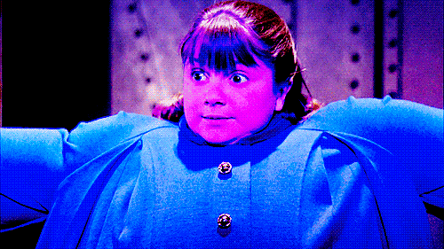
It’s impossible to talk about violet in pop culture without invoking perhaps its most literal and chaotic embodiment: Violet Beauregarde in Willy Wonka & the Chocolate Factory. A champion gum-chewer with a fiercely competitive streak, Violet’s very name serves as a kind of ominous prophecy, a chromatic foreshadowing of her downfall. Her transformation into a giant, swelling blueberry after chewing the forbidden gum is one of the most iconic cautionary visuals in cinematic history. And when her panicked father cries out, “Violet, you’re turning violet, Violet!” it’s both comedic and eerily poetic. The repetition of her name, the absurd color shift - it’s a moment that crystallizes how easily indulgence can tip into mutation.
On a metaphorical level, Violet’s fate mirrors the tension embedded in the color itself: allure teetering into excess. Once symbolic of pride and precociousness, her name becomes the punchline to a visual gag that lingers in our collective memory. But it also speaks to how color, character, and consequence are deeply intertwined, how a single hue can become shorthand for a story.
“Violet, You’re Turning Violet, Violet!”

Violet in Modern Branding: Quiet Power, Unconventional Appeal
Violet has seen a branding resurgence, especially among companies that want to stand out as thoughtful, future-forward, and just a little bit unexpected. Not quite as luxe (or overplayed) as royal purple, and not as soft as lavender, violet offers edge with elegance. Its versatility makes it a bold yet surprisingly flexible choice for modern branding. And its many shades, from punchy lilacs to deep, dusky plums, allow for nuanced expression across categories
Here’s how it’s being used:
1. Self-Actualization & Tech That Feels Magical
Apps and platforms in wellness, AI, and personal development use violet to signal transformation.
Example: Calm has played with soft purples to encourage rest and inner reflection. Notion recently integrated violet gradients for their 2025 refresh, blending productivity with creative flow.
2. Modern Femininity Without the Stereotypes
Forget the bubblegum pink. Violet offers a gender-neutral alternative that still feels sophisticated and expressive.
Example: Glossier’s limited-edition packaging in a pale, moody violet created buzz for feeling both nostalgic and fresh.
3. Edgy Elegance in Fashion & Beauty
Violet evokes the avant-garde. Brands in fashion and beauty are using it to telegraph otherworldly allure.
Example: Byredo’s limited edition “Purple Echo” Palette and Isamaya Beauty’s offbeat campaigns feature high-saturation violets to suggest mystery, intellect, and depth.
Digital Design: Using Violet Without Going Saccharine
Violet’s presence in digital design can be a double-edged sword: it offers elegance, whimsy, and warmth, but without careful treatment, it can quickly tip into childlike or overly sweet. The key lies in restraint and juxtaposition.
Pairing violet with warm neutrals (like sand, stone, or clay) can ground the hue and lend it sophistication. Alternatively, contrasting it with a sharp electric (like acid yellow or cobalt blue) gives it edge and attitude, transforming it into something unexpected and editorial.
Design-wise, violet can also serve as an excellent accent color for micro-interactions, hover states, or call-to-action highlights. It subtly breaks from the blue/orange binary that dominates the web without overwhelming a user’s visual field. Think of it as a wildcard that, when handled thoughtfully, creates memorability without screaming for attention.

Building a Violet-Forward Palette
Violet is rarely used alone. It’s a harmonizing hue that can shape the entire feel of a brand system. Consider pairing it with:
Soft ochre or terracotta for warmth and grounding
Charcoal or navy for gravitas and contrast
Pale lilac or periwinkle to expand the emotional spectrum
Metallic silver or iridescent finishes to push into the futuristic
Final Word: A Color for Visionaries
Violet has always belonged to those willing to see differently, from the Impressionists to today’s design rebels. As brands push beyond aesthetics and into emotional, immersive storytelling, violet is uniquely positioned to carry the weight of nuance.
It’s a shade for the intuitive, the idealistic, and the imaginative.
In a sea of safe choices, it’s a signal that you’re not afraid to feel something.


